Source
thedieline.com
The Iconic Italian Beer Peroni Gets a Classy New Look from Smith Lumen
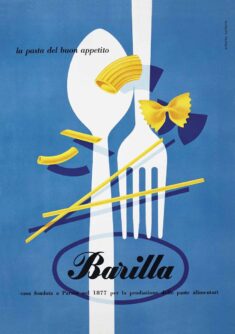
Peroni’s redesign ditches the serif for a logomark that’s less Helvetica and more midcentury Italian liquor poster, a vibe that’s felt especially trendy lately. The resulting banner gives the brand a look that feels perfectly aligned with current aesthetics but is understated enough to outlast the fickle whims of the modern trend cycle.
The Iconic Italian Beer Peroni Gets a Classy New Look from Smith Lumen Published by Maan
Welcome
Copyright 2024 design inspiration. All work copyright of respective owner. TOS | Privacy Policy | Copyright | Contact us
Hand-crafted & Made with ❤️ Some Events


